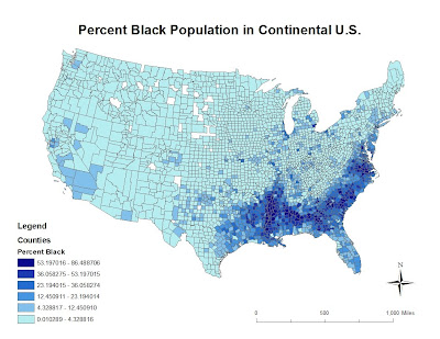
In this final lab I created 3 thematic maps of 'Black', 'Asian', and 'Some Other Race Alone' populations in the continental U.S. using data from the U.S. 2000 Census as posted below.

This map depicts the percent Black population in the United States in 2000 based on Census data. Counties within the continental U.S. are outlined so that the population can be seen and analyzed in detail. We find a large Black population percentage in the southeast. There is also a noticeably large concentration in Southern California. The highest percentage ranges from 53 to 96 % of the entire U.S. population, while a few counties in the Midwest have no Black populations.
 This map displays the percent Asian population in the continental United States according to 2000 Census data. Most counties have a small percentage of Asians, creating a relatively even distribution across the country. The highest concentrations are found along the West Coast, especially in California, and along the East Coast in New England. The map also reveals a large population in a Texan county. Again, there are a few scattered counties with no Asians in states like Nevada, Texas, and some Midwest states.
 This last maps shows the percent population of some other race alone across the continental Unites States. 'Some other' includes races besides Black, Asian, or non-Hispanic white. The western half of the U.S. has more racial diversity as represented by the darker green shades. The lighter green color that makes out the rest of the country reflects the small percentage of "Some Other Races Alone' in the eastern United States. Once again, California, Washington, and Texas stand out with the highest percentages.
This thematic Census map series reveals much about the United States population as well as the map-making process, from data acquisition to creating a personalized final product. While U.S. Census data is readily available online, one needs the know-how to convert it into a usable file and to join data layers to produce a map. The use of color ramps and classifications helps visually demonstrate the differences between regions, counties, and other scales within the country. In my three maps, darker colors represented higher percentages of the specific race. I found that the highest percentages of blacks are found in the southeast, highest percentages of Asian along the West and East coast, and the greatest percentages of other races along the Western United States.
Geography 7 has officially come to an end, but the possibilities from here are truly endless. It has been a learning experience every step of the way, and I am proud to have produced a variety of maps to show for it. There is undoubtedly much more to learn in the ArcGIS program, which can only come by spending more time with the program and familiarizing myself with the various tools and processes. I have only dealt with the tip of the GIS iceberg, yet I have undoubtedly developed a new-found skill and appreciation of maps and their potential to communicate.
No comments:
Post a Comment